Power of Contrast in Poster Design: How to Use Color and Tone to Create a Striking Visual Impact
With roots in print advertising and marketing, poster design is a centuries-old art form. Creating aesthetically appealing posters that stand out in a competitive market requires designers to stay on top of the most recent trends and techniques.
Poster design is now a crucial component of branding, advertising, and marketing strategies. The use of contrast is one of the key components of great poster design.
To provide a visually arresting impact, contrast refers to the utilization of variations in color, tone, size, or shape.
This article will examine the influence of contrast in poster design as well as how color and tone can be used by poster designers to make a powerful visual statement.
What is Contrast in Poster Design

The contrast in poster design refers to the degree of differentiation between two or more design components. It is a crucial design idea that aids in establishing visual hierarchy and attention in the poster.
Contrast can be achieved through various design elements, such as color, size, shape, texture, and typography.
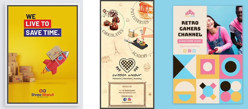
For example, using contrasting colors such as black and white, or complementary colors such as red and green can create a strong visual impact and draw the viewer’s attention to a specific part of the poster.
Similarly, using large and small text or different font styles can create contrast and help poster designers emphasize important information.
Using contrast effectively can also help establish a clear visual hierarchy in the poster, with the most important information standing out the most. This can help the viewer quickly and easily navigate the poster and understand its message.
Overall, contrast is an important design principle to consider when creating a poster, as it can help make the design more engaging, effective, and memorable.
How to Use Color and Tone to Create a Striking Visual Impact
Color and tone are powerful tools for creating a striking visual impact in art, design, and photography. Here are some tips on how to use color and tone effectively:
1. Understand Color Theory
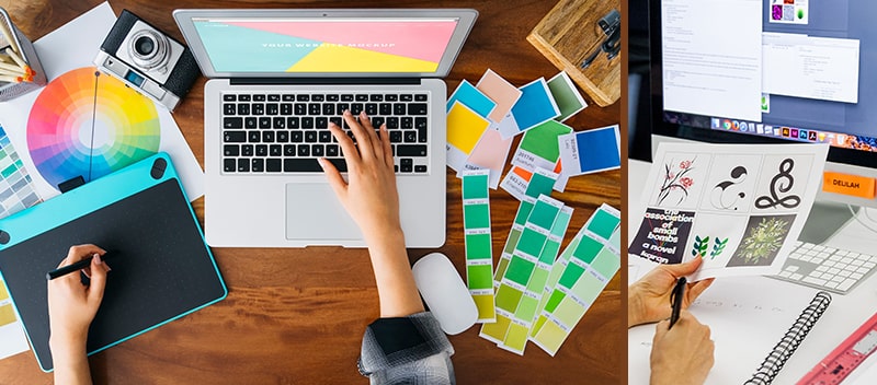
The study of how colors interact with one another is known as color theory. Having a solid understanding of color theory can help you select complementary colors for your palette and employ contrasting hues to make a statement.
For instance, the employment of complimentary hues, which are opposites on the color wheel, has a powerful visual effect.
2. Use Contrast
When two items have contrasting colors, tones, or textures, contrast is produced. The contrast in poster design may serve as a focal point by directing the viewer’s attention to a particular component. Black and white photography and other high-contrast photographs may be very stunning.
3. Use Light and Shadow
The depth and dimension of a picture may be created through light and shadow. You can produce dramatic effects and highlight particular features by adjusting the light and shade.
4. Consider the Emotional Impact
The viewer’s emotions can be evoked by certain colors and tones. Warm hues like red, orange, and yellow, for instance, might evoke feelings of warmth and vitality, while cold hues like blue and green, on the other hand, can evoke feelings of serenity and peace.
5. Use Color and Tone to Tell a Story
A certain message or narrative may be conveyed via the use of color and tone. If your logo colors describe your brand identity, a subdued color scheme might evoke feelings of melancholy and a vibrant and lively color scheme might evoke feelings of enthusiasm and excitement.
The Power of Contrast in Poster Design
Using contrast effectively in poster design can create a powerful visual impact that immediately draws the viewer’s attention.
By using contrasting colors, tones, sizes, and shapes, designers can create a sense of depth and dimension in their designs, making them more engaging and memorable.
Contrast can also be used to create a hierarchy of information, guiding the viewer’s eye toward the most important elements of the poster.
One of the main advantages of employing contrast in poster design is that it may contribute to the development of a sense of harmony and balance.
Effective contrast may pull together diverse pieces to form a coherent whole, giving the design a sense of oneness.
This is particularly relevant when designing posters since there are several aspects, like text, graphics, and logos, that must be balanced.
Nevertheless, it’s important to employ contrast sparingly and avoid going overboard. Too much contrast might have a disorienting impact that takes away from the poster’s main point.
Poster designers should aim to achieve harmony and contrast in harmony, employing contrast to complement rather than overwhelm the design.
Tips for Using Contrast in Poster Design

There are a few important guidelines to remember while employing contrast in poster design. Consider the message you want to deliver before selecting contrasting pieces to complement it.
For instance, you may use strong, brilliant colors to evoke a sense of energy and enthusiasm while making a poster for a music festival.
Second, consider how the poster is put together as a whole. Effective use of contrast demands a strong design sense, and designers should pay attention to the size and arrangement of various elements.
A sense of hierarchy and significance may be created, for instance, by employing contrasting sizes, but designers must take care not to overwhelm the observer with too many enormous items.
Pay attention to the color scheme you select. While utilizing a lot of clashing hues might be overwhelming, doing so can also provide a remarkable visual impact.
Poster designers should try to stick to a small number of colors, concentrating on two or three main hues that go well together.
Lastly, try out various combinations of opposing pieces and be open to experimenting. Trial and error is the best method to learn how to use contrast in poster design successfully, so don’t be hesitant to try out various hues, tones, sizes, and shapes until you discover a combination that works.
Conclusion
Contrast is an effective strategy for creating a strong visual impression in poster design. Sprak Design has professional poster designers who may add depth and dimension to their designs, making them more captivating and memorable, by employing contrasting colors, tones, sizes, and forms.
Effective contrast in poster design may also pull diverse components together to form a unified whole, creating a feeling of harmony and balance.
While creating a poster, a designer should think about the message they want to express, pay attention to the poster’s overall composition, be cognizant of the color scheme, and be willing to experiment.
Poster designers may produce aesthetically appealing posters that stand out in a competitive market and successfully convey their message to the audience by keeping these pointers in mind.

