

Creative Banner Ads Design Ideas You Need to See
Let’s Make Your Brand Stand Out!
The blog shares nine brilliant banner ad design ideas, with tips and insights shared by top banner designers. Increase web traffic and generate sales and leads effectively using brilliant banner ad designs. Banner ads require three components. Linking these and designing a minimalistic ad creates an urge among the visitors to take action and be your customer.
Banner ads! The most effective path for pushing business outcomes to their best. The awakening of banner ads started in the year 1994. And as the years passed, who knew it would rule the online advertising platform as digital banner ads.
Digital banner ads not only became an influential aspect in picking out the right customers but also happened to be the base of the development across the board of the digital advertising market.
As the importance of it is rising to the peak, one should understand how to create a top-notch banner ad and find an expert banner designer from the finest banner design agency. Before you hire a banner design agency, get insights into important facts and aspects of banner designing.
What Are Banner Ads?
Banner ads are a way for companies to enhance their brand awareness among people. It is a form of creative digital advertisement made up of images ingrained on web pages to display products, services, and brands for bringing organic traffic, click-throughs, sales, and leads. These ads are merged with the advertiser’s website. So, when people click a specific banner ad, it connects the visitor to the website for which the banner ad was designed.
Banner ads are the most inexpensive, measurable, and influential medium to enhance brand awareness. They are placed where the audience gazes the most on a webpage. It can be at the front, the base, or sides of the web pages.
Creative Banner Ad Design Ideas
A great banner ad should always be presented in a pure and simple yet attractive way that points out what is being promoted. Within that amount of time, your audience should fall for that ad, clicking and making a stop at your website.
People love minimalistic designs. And with that said, let us check out the primary attributes that you need to understand before creating a captivating banner ad.
1. Choose the Right Size
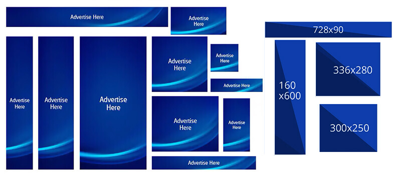
There are many standard ad sizes, and keeping a keen eye on each of them and finding the best one that works for you is a crucial task. Here are the considerably utilized banner ad sizes:
Square: 250 * 250
Small Square: 200 * 200
Banner : 468 * 60
Leaderboard : 728 * 90
Inline Rectangle : 300 * 250
Large Rectangle : 336 * 280
Skyscraper: 120* 600
Wide Skyscraper : 160 * 600
Half – Page Ad: 300* 600
Large Leaderboard : 970 * 90
Among these, the higher-performing standard banner ad sizes in 2022 are the following:
Medium rectangle : 300 x 250
Large rectangle : 336 x 280
Leaderboard : 728 x 90
Half-page or large skyscraper: 300 x 600
Mobile leaderboard : 320 x 50
2. Visual Hierarchy
As you know, hierarchy refers to a specific pattern that individuals use to scan a design or document according to the level of authority. Let me make it simple.
Usually, people tend to read from left to right, and when they visit a page or a design, their eyes usually move towards it in the following order. Top, left, right, center, and finally, the base of the design. Hence, the information that you would like to put in the banner should be concerning this pattern. An expert banner designer knows how to use people psychology for the benefit of the company.
3. Add Branding Elements
When you are creating a banner ad for a website, the following elements are crucial and should be in the following visual hierarchy.
The Company Logo
The Value Proposition
Call – To – Action (CTA)
Allow me to walk you through these components.
The company Logo
A logo should be a prior factor in your banner ad. It should seem dominant enough to create brand awareness and credibility among people, enhancing trust with an organization. But ensure that it is not too dominant concerning the value proposition and the CTA. It is usually placed on the top left corner or top right corner of the web banner.
The Value Proposition
If you ask a banner designer which factor takes most of the space in a banner ad, he or she would say it is this one. Wait, what is a value proposition anyway? It is about providing clear-cut information on how your company’s products and services will benefit the requirements of your valuable customers.
It must not only be designed/placed in a way to grab the attention of your target audience but also should plant a mindset of clicking and buying the product. You could specify offers and discounts under it. Believe me, it works! Whenever I look for a product or service, my eyes gaze out to those parts.
Call – To – Action (CTA)
I call it the interactive button. It shall be kept on the right corner of the banner with a compelling button that says, “Try for free,” “Subscribe,” or “Join us,” etc. Why do we require such buttons?
Well, it is a great way to allow your customers to skim over your ideal conversion. For further understanding, you could just analyze the banner ads or even web pages that have a CTA with the ones that do not have it. Honestly, the click-through rates of the ones that have a CTA button are more compared to pages/ads that do not have it.
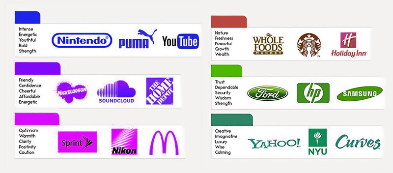
4. Experiment With Font Types
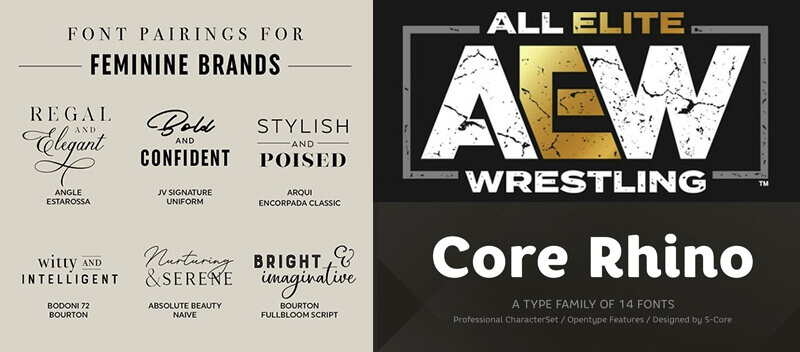
Selecting the accurate font can be tricky and challenging. Most of the commonly used fonts that I have seen are Times New Romans, Garamond, and Trajan. They are pretty good. However, today let us focus on different combinations of fonts that could give visual balance and contrast.
An interesting pair of fonts is the fusion of serif alongside sans serif. Serif fonts are old yet traditional, whereas sans-serif is modern and gives a neat look. The mixture of any of the fonts from these two would give a package of a visually attractive look.
Let me point out other 5 font combinations that will help you in choosing the right font for your banner ad.
Raleway Bold and Source Code Pro Regular
Luckiest Guy and Bitter Regular
Crimson Text Regular and Source Sans Pro Regular
Lato Light and Lato Regular
Montserrat Bold and Roboto Regular
You could try any of the above-given ideas to get a good font type that fits your brand. Even if you did not find the right one with these, take this information as a way to identify your ideal font types and experiment with them.
5. Try Animated Typography
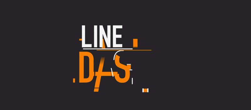
A simple definition for animated typography is a text that moves. If you are looking to amuse, set a tone, and engage your audience, this will suit you well. I mean, who doesn’t love a bit of animation, right?
Some of the creatively animated typography techniques are given below:
Morphing
Flickering text
Hypnotizing text
Geometric constructions
Fluid Geometry
Dynamic Montage
Neon Flickering effect
Dash typography
Scrabble effect
Accelerated typography animation
6. Message Should Be Instantly Readable
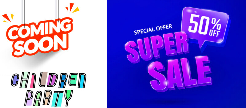
When you write a copy, you must not forget that you are writing it for the audience. Look from their perspective and ask yourself if what you wrote is clear, concise, and properly placed with visually appealing fonts and colors.
The above-mentioned facets will give you a hand in clarifying your message to the people. Moreover, the users will never spend time looking at your craft. All they’ll take is 1 sec, and then Boom! They will never take a look at that banner again. So, make a clarifying statement on what your brand is about in not more than 10 words and ensure you place everything in perfect harmony.
Remember, readability plays a key role in the conversion of visitors into customers.
7. Design The Frame With Perfect
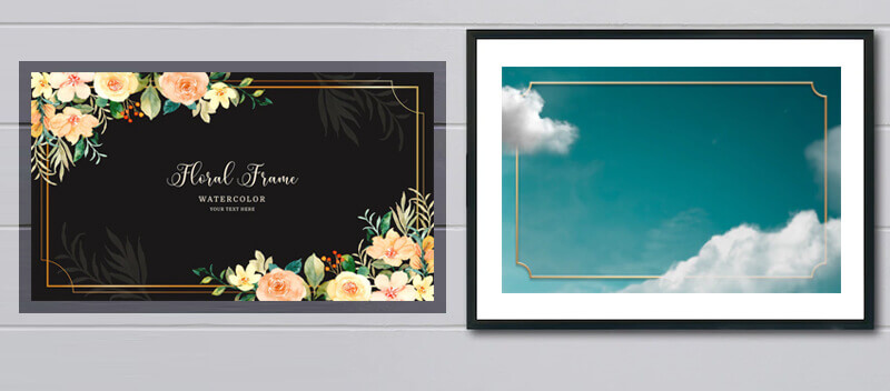
I get attracted when I see something, especially the images and written copy kept in a box. I think most people do love it and recommend it. More importantly, it helps in differentiating regular web content from an ad. Hence, create a border of at least 1px (pixels) to create a clean look for the banner ad.
8. Use Relevant Imagery And Icons
Visually expressive images can speak in high volume, the same as a copy. As I have mentioned before, people love minimalistic designs and using imagery or icon that fits an ad can create a huge impact on the viewers. There is a stream of icons to pick from. But the vital part is choosing the right one and sticking to it all around the design to make it look harmonious.
On the other hand, make sure to keep an image as the background pairing well with all the elements as it will stand up to make a profound bond among the visitors and the brand. But you do not have to forcefully add images/icons if there is no need. Use it if you find it helpful in conveying your brand message!
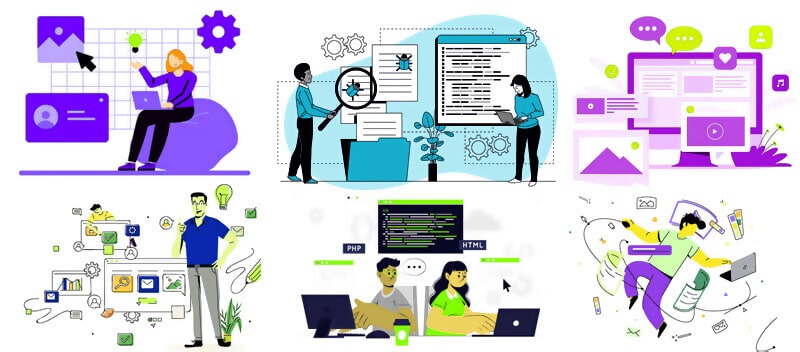
9. Experiment Illustrations
Even if you do not find matching imagery or an icon, don’t worry. You can employ illustrations to convey an anecdote about your brand. Moreover, it will add uniqueness to your banner ad, enhancing personality and a feel of zeal.
Conclusion
What you think is what you create. A banner ad design is a representation of your creative mindset and the information that you tend to express. So, the more clear you are about a particular brand, the more elegantly you can create a banner ad. Make sure to try out all the factors that I explained, and I hope you get the best out of it.
Språk Design
Having worked for various companies and helped them create a banner design that created awareness among people, we can confidently say that we are the best banner design agency with great banner designers who focus on your brand and develop a creative design that you desire. So what are you waiting for? Jump in with us soon!