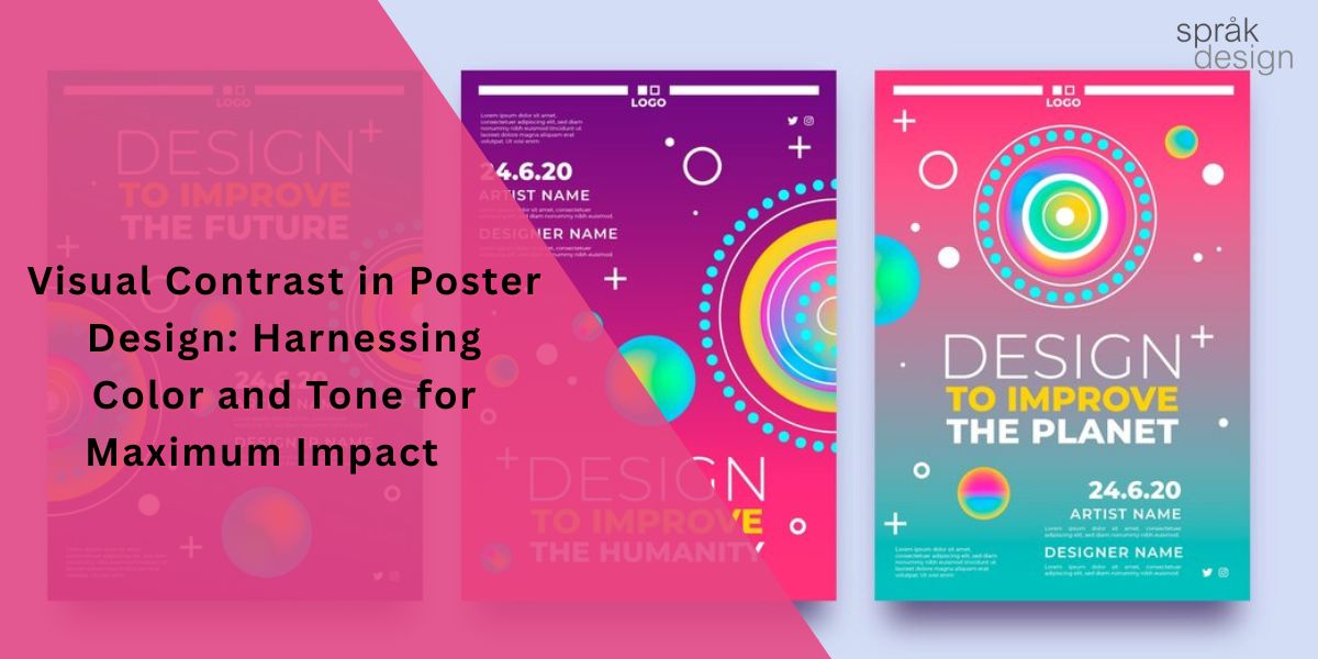
Visual Contrast in Poster Design: Harnessing Color and Tone for Maximum Impact
Poster design has its roots in centuries of print advertising and marketing. To create eye-catching posters that shine in a crowded marketplace, designers must stay aware of evolving trends and innovative techniques.
Today, posters are an essential part of branding, advertising, and promotional campaigns. Among the most powerful tools in a designer’s toolkit is contrast—the strategic use of differences in color, tone, size, and shape to create visual interest.
This article explores how contrast shapes compelling poster design and how thoughtful use of color and tone can help designers deliver a striking visual message.
Understanding Contrast in Poster Design
In poster design, contrast refers to the level of difference between two or more elements. It’s a core design principle that builds visual hierarchy and immediately captures attention.
Designers can introduce contrast through:
- Color: Pairing opposites such as black and white, or complementary colors like red and green, creates bold focal points.
- Size and Typography: Mixing large and small text or pairing different font styles emphasizes key information.
- Shape and Texture: Distinct textures and shapes guide the viewer’s eye and enhance depth.
Using contrast wisely ensures important details stand out, allowing viewers to navigate the design quickly and grasp the main message. Done well, it transforms a simple poster into something memorable and engaging.
Color and Tone: Keys to a Bold Visual Statement
Color and tone are essential for building dramatic impact in posters, art, and photography. Here’s how to apply them effectively:
- Master Color Theory
Learn how colors interact. Opposite hues on the color wheel—known as complementary colors—create dynamic energy and immediate appeal. - Play with Contrast
Combine differing colors, tones, or textures to create focal points. High-contrast visuals, like black-and-white imagery, naturally command attention. - Use Light and Shadow
Thoughtful lighting adds depth and drama. Highlights and shading can accentuate specific details and create three-dimensional effects. - Consider Emotional Response
Colors evoke feelings. Warm shades such as red, orange, and yellow radiate energy and warmth, while cool tones like blue and green convey calm and serenity. - Tell a Story Through Color
Your palette can communicate mood and brand identity. Muted tones might suggest nostalgia or elegance, while vivid colors project excitement and vibrancy.
The Power of Contrast in Action
Effective contrast instantly captures attention and draws viewers into the design. By mixing bold colors, varied tones, and differing shapes or sizes, designers create depth and rhythm that make their posters more captivating.
Contrast also organizes content. A clear hierarchy directs the eye to critical information first, ensuring the main message is quickly understood.
When applied with care, contrast brings balance and harmony, uniting diverse elements—text, graphics, logos—into one cohesive design.
However, restraint is key. Overuse of contrast can feel chaotic and distract from the message. The goal is to complement the composition, not overwhelm it.
Practical Tips for Using Contrast
To make contrast work effectively:
- Define Your Message First
Align color and tone choices with the emotion or story you want to tell. For example, a music festival poster might benefit from vivid, energetic hues. - Plan Your Layout
Strong design sense is vital. Use contrasting sizes and placements to guide the eye but avoid cluttering the space with oversized elements. - Limit Your Palette
A few carefully chosen colors—two or three main hues—maintain harmony while still delivering visual punch. - Experiment Freely
Test different combinations of tones, shapes, and sizes. Trial and error helps you discover the perfect balance for your design.
Conclusion
Contrast remains one of the most powerful tools in poster design, adding depth, balance, and unforgettable appeal.
By thoughtfully blending color, tone, size, and shape, Sprak Design‘s expert poster designers craft visuals that not only stand out but also convey messages with clarity and style.
When creating your next poster, define your message, refine your layout, keep your palette balanced, and embrace experimentation. With these practices, you can produce striking, memorable designs that capture attention in any competitive space.

